
Old holborn
Old Holborn is a brand of hand rolling tobacco that uses their packaging of pouches and filter tips as a means of marketing. They launch selective Filter Tip Editions and Pouches approximately every six months, where the artwork on the packaging circles around a concept regarding fun facts, tips or seasonal themes , always of course including their famous elephant and logo.
Seasonal Filter Tips (Proposal- Not Released)
Christmas Filter Tips (Proposal- Not Released)


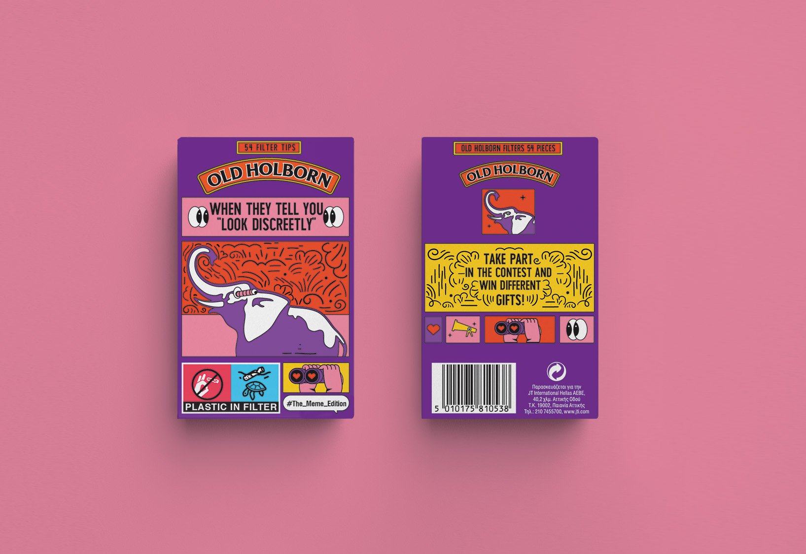
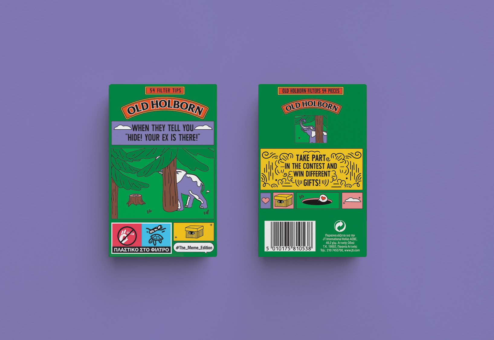
Filter Tips // Summer 2018
The idea for this special edition was to create a packaging where typography took over most of the surface with a funny greek fact about summer. For each different fact, a small illustrative symbol would accompany the text that regarded the fact. The O.H elephant is placed steadily within the window frames created, with the text in a speech bubble above him, making it seem as though its the elephant “talking” to the consumer.
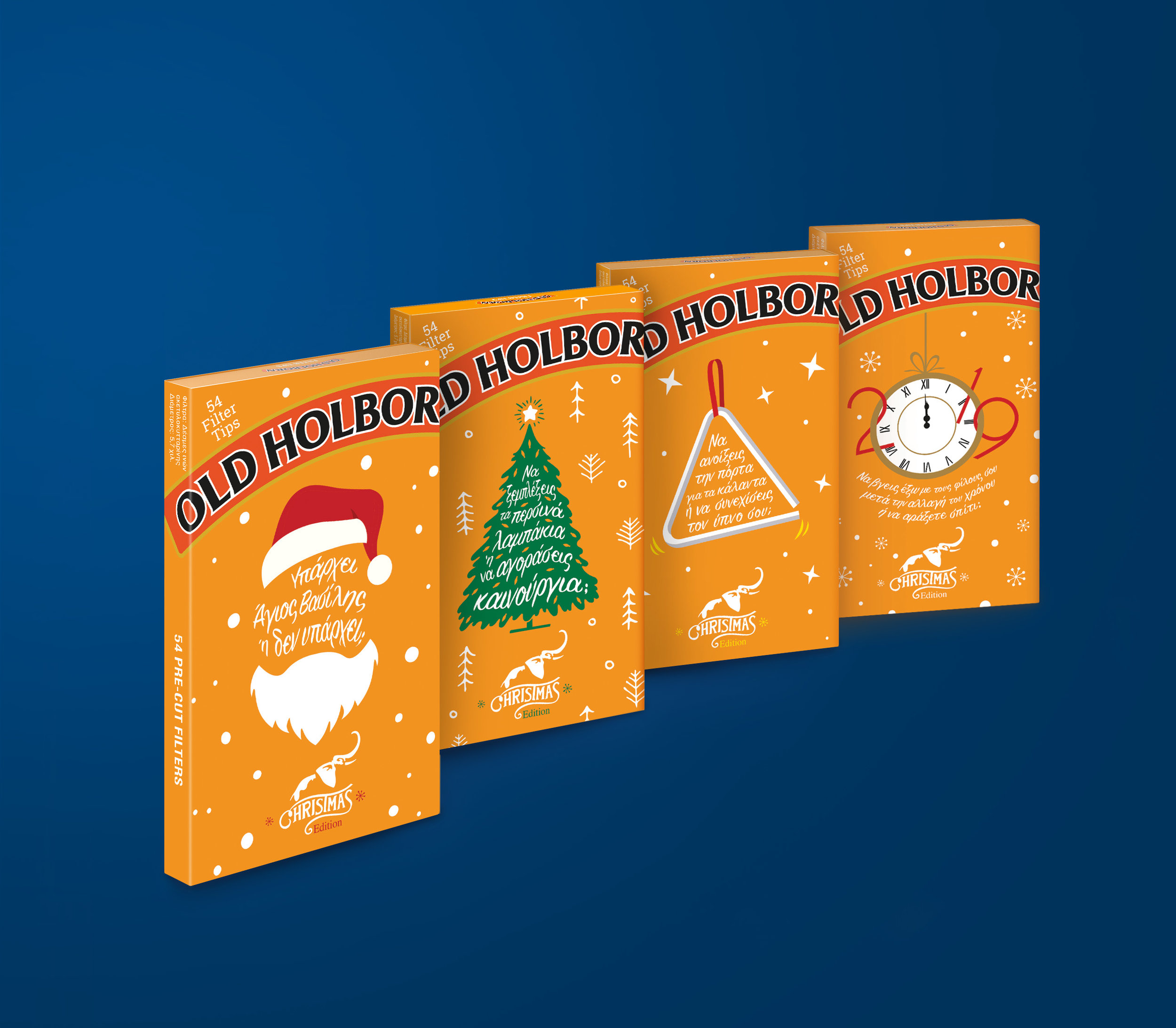
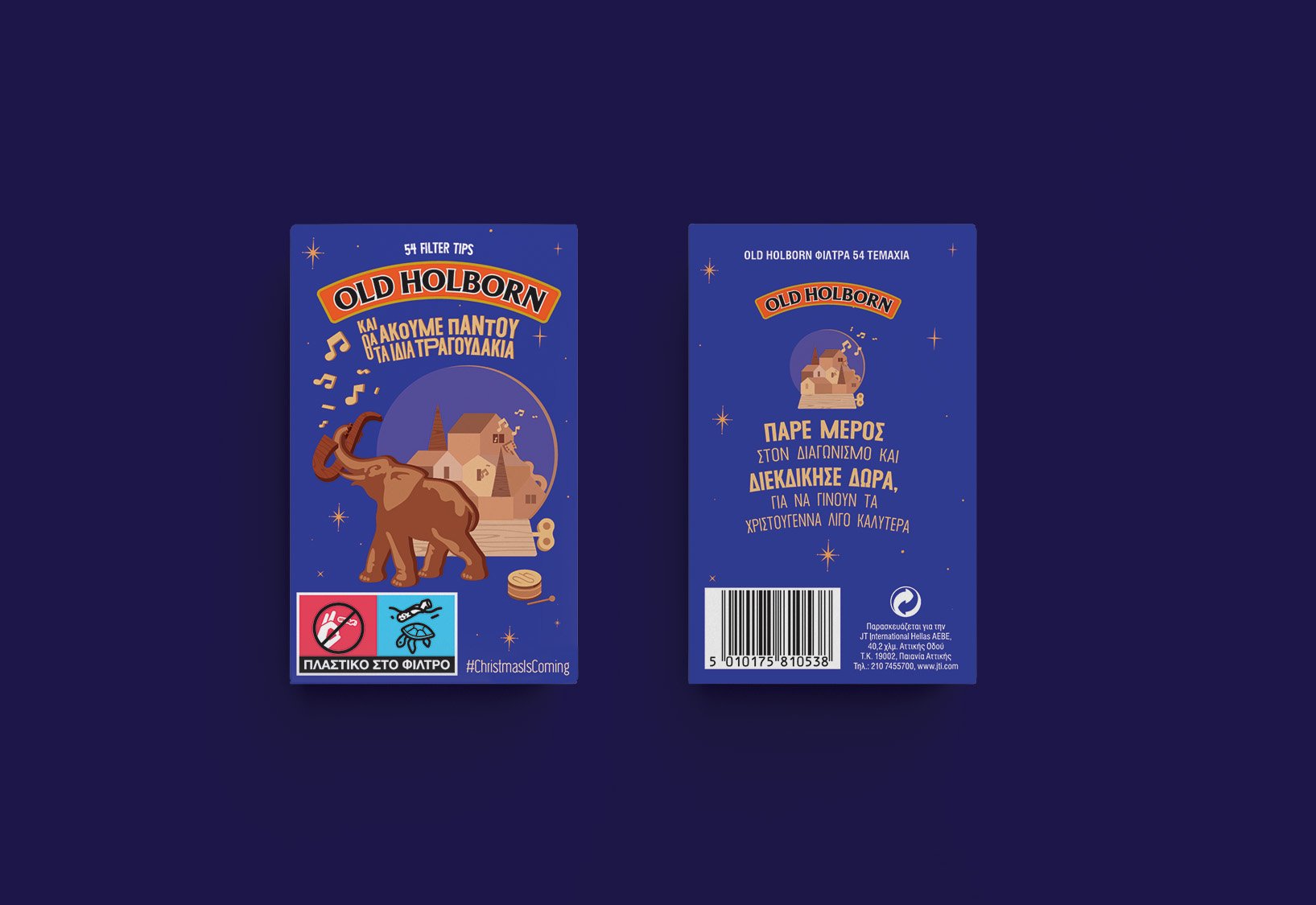
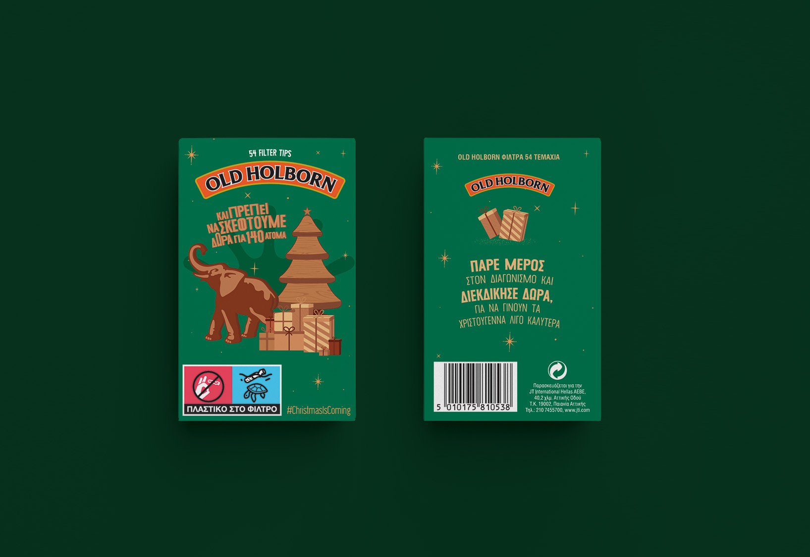
Christmas Edition 2019
This special edition focuses on Christmas Beliefs by setting a dilemma that you may have during the holidays. For example: Is Santa real or not? Untangle last years Christmas lights or buy new ones? Open the door for the jingles or carry on sleeping? On New Years, go out with your friends or stay on?
Using abstract forms, the aim here was to use typography to circle around or within the artwork itself.
In this case, the protagonist of the packaging isn’t the elephant himself but instead he signs of at the bottom of each pack, entwined with the Christmas logo for this edition.

miniature christmas book proposal
Christmas Proposal, where the pack itself turns into a miniature Christmas book. Each packaging would resemble a Christmas story where the elephant would star as our main protagonist. The title for each would be altered into different versions that remind one of Christmas. At the back of each packaging the consumer would be able to scan a QR code, that would link them to a micro-site where they could read each unique short story.

christmas poster proposal
This proposal would strain from the usual Filters, by making each selective pack a Christmas poster. Using one main color for each would differentiate the packs, placing the elephant organically into the artwork and of course always resembling what the title of the poster regarded.

Promotional Campaign
Introducing a new tagline for the brand, Leave your Mark was created to shift the brand from its regular course. Therefore, installations and interior/exterior design were created to suggest, perhaps, the new look and feel that the brand would adapt for a certain period of time.